30 Master Paintings: Close Readings
These are close, opinionated readings rather than definitive art history. For each painting, the focus is one possible explanation of what makes it land, the compositional choices behind that effect, and what you might take into your own work. The sequence moves roughly from intimate stories to epic ones.
This is a supporting reference, not a canon or a ranking of “correct” art. These 30 were chosen because they connect directly to subjects elsewhere in the Library. When an entry cites a master reference, you can find one reading of it here — and disagreeing with that reading is part of looking closely.
The most famous painting of loneliness in American art — and it works because of one compositional decision that most people never notice.
A late-night diner on a street corner. Three customers and a counterman. Bright fluorescent light inside, dark street outside. The couple sits together but isn't interacting. The solo figure has his back to us. The counterman is mid-task. Nobody is talking.
There's no door. Look at the painting. The diner wraps around the corner, all glass, no visible entrance. The figures are sealed inside, like specimens in a display case. The viewer is outside, on the dark sidewalk, looking in. You can't enter this world. And the people inside can't leave it. The glass separates them from the night AND from you.
The second move: the light is wrong. The diner is lit like an operating room, bright, even, clinical. It SHOULD feel warm (it's the only lit space on the block) but instead it feels exposed. The light doesn't comfort; it reveals. Everyone in the diner is visible to the empty street. They're alone AND on display.
The third move: the couple that isn't a couple. The man and woman sit side by side. Their hands almost touch. Almost. The six-inch gap is the loneliest space in the painting, two people who could connect and aren't. Hopper paints the gap, not the figures.
The barrier you can see through. Glass, a window, a screen, anything that lets the viewer SEE connection but not REACH it. This is the compositional device for isolation: proximity without access. Use it whenever you want the viewer to feel locked out of (or locked into) a scene.
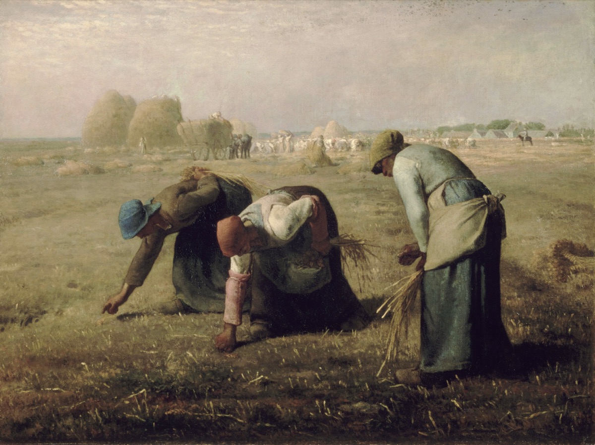
Three women picking up leftover grain after the harvest. That's all. No drama, no mythology, no allegory. Just labor. And it changed art history, because Millet gave these women the compositional treatment previously reserved for gods and kings.
The scale reversal. The three women are HUGE, they dominate the foreground, filling the bottom third of the canvas. Behind them, in the distance, the harvest is being gathered by dozens of workers, with haystacks piled high and a landowner on horseback supervising. The people with power are small. The people with nothing are monumental. Millet flipped the hierarchy using nothing but scale.
The bending. Each woman bends at a different angle, the leftmost is nearly horizontal, the middle is mid-bend, the rightmost is just beginning to stoop. It reads like a sequence, like watching one person bend in slow motion. This rhythm turns a static image into a CYCLE: bend, gather, rise, bend again. You feel the repetition in your body. It's endless. It won't stop when the painting ends.
The golden light. Millet bathes the scene in warm, late-afternoon light — the kind of light that photographers call "magic hour." He gives the gleaners the same light Turner gave to Venice, the same light Claude Lorrain gave to classical ruins. The light says: this is sacred. The subject says: these are the poorest people in the field. The contradiction is the painting's moral force.
Give humble subjects heroic treatment. The light of mythology. The scale of history painting. The composition of an altarpiece. Apply them to a nurse, a janitor, a line cook. The gap between the subject's social status and the painting's formal grandeur IS the statement. You don't need to write an essay about dignity. You just need to light the figure like Millet lit the gleaners.
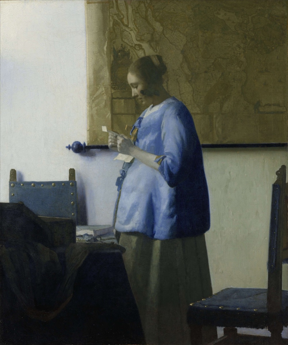
A woman in a blue morning jacket stands by a window reading a letter. Her belly is visibly swollen, she appears to be pregnant. We don't know what the letter says. We'll never know. And that's why this painting has been looked at for 360 years.
The withheld information. Every element in this painting exists to protect a secret. The letter's contents are hidden from us. The woman's expression is absorbed but unreadable, is it good news? Bad? Longed-for? Dreaded? The map on the wall behind her suggests distance, the letter came from far away, perhaps from a husband or lover — but tells us nothing specific. And then: her pregnancy. The swollen belly under the blue jacket raises the emotional stakes of the letter enormously. Is the sender the father? Does he know? Is he coming home? Vermeer gives us everything we need to IMAGINE the story and nothing we need to KNOW it. The viewer fills in the blanks with their own experience, and the painting becomes personal.
The light as tenderness. The window light falls on the woman's face, her hands, the letter, and the curve of her belly, the four most important things in the painting. It's soft, even, forgiving. Vermeer's light doesn't dramatize (like Caravaggio) or idealize (like Bouguereau). It simply ATTENDS. The light looks at the woman the way a caring person would look at her: with patient, steady attention. This is what people mean when they say Vermeer's paintings feel like love.
The geometry of privacy. The woman is turned away from us, we see her in near-profile. A chair blocks the lower corner, keeping us at a distance. The table creates a barrier. Vermeer composed the space to make us feel like we've accidentally walked into someone's private moment. We should leave. We can't.
Show someone engaged with something the viewer can't see. A letter, a phone screen, a book, a face outside the frame. The viewer's imagination will supply content that's more powerful than anything you could depict, because it will be THEIR content, drawn from THEIR life. Withheld information is the most powerful tool in single-frame storytelling.
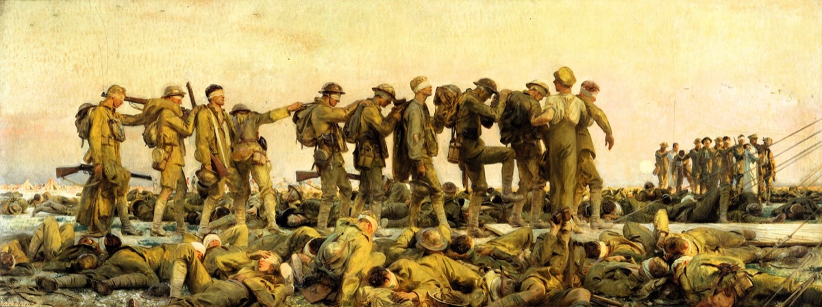
Twenty feet wide. A line of soldiers blinded by mustard gas, stumbling forward with hands on each other's shoulders, guided toward a dressing station. In the foreground, more blinded soldiers lie on the ground. In the background, a football match is being played — soldiers who can still see, passing time. The most ambitious war painting ever made, and the most compassionate.
The processional format. Sargent composed it as a FRIEZE, a horizontal parade, like the Parthenon marbles or a Roman triumphal procession. This format was traditionally reserved for heroes, gods, and victorious armies. Sargent uses it for a line of blinded, defeated men. The irony is devastating: the format says "glory." The content says "ruin." Every viewer feels the contradiction without needing to articulate it.
The touch. Look at the hands. Each man's hand rests on the shoulder of the man in front. This is the painting's emotional center, not the blindness, but the TRUST. Each man is following someone he can't see, trusting that the person ahead knows the way. (They don't, they're blind too.) The dependence is total. The vulnerability is total. And the tenderness of the touch, gentle, uncertain, gripping — is the most human gesture in 20th-century painting.
The sunset. The sky is golden. Late afternoon light warms the scene. It's BEAUTIFUL. Sargent could have painted gray skies, rain, mud. He chose beauty, and that choice is cruel and correct. The world doesn't stop being beautiful when people suffer in it. The beauty doesn't comfort. It persists, indifferent. That's worse than darkness.
Beautiful light on a terrible subject. Don't match the mood with the lighting. CONTRADICT it. Joy in harsh light feels anxious. Suffering in golden light feels unbearable. The contradiction between what the eye enjoys (the light) and what the heart registers (the content) creates a tension that neither alone could achieve. Sorolla understood this too, "Sad Inheritance" uses the same device.
A woman in a pink dress lies in a dry grass field, her body twisted toward a farmhouse on the distant hill. She's reaching for it, or pulling herself toward it. She can't walk. The field between her and the house is enormous. That field is the painting.
The proportion of desire to distance. The figure occupies the lower left corner — small. The house occupies the upper right, small. Between them: nothing. A vast, sloping field of brown grass. The empty space IS the painting. Wyeth made the composition mostly emptiness, and that emptiness is the emotional content. The distance between the woman and the house, achievable by a walking person in two minutes, impossible for Christina, is a proportion. The painting makes you FEEL the proportion, not just see it.
The back. We see Christina from behind. We never see her face. This is critical. If we saw her expression, we'd read a specific emotion, sadness, determination, despair. By hiding her face, Wyeth makes the viewer PROJECT their own feelings onto her. Every person who's ever wanted something they couldn't reach sees themselves in this figure. The universality comes from the withheld face.
The grass. Wyeth painted each blade individually, in tempera — a painstaking, slow technique. The field is not a blur. It's 10,000 specific blades of grass. This obsessive specificity makes the distance REAL. You don't just see a field. You feel the texture of every inch Christina would have to crawl across. The craft makes the suffering concrete.
Make the space between the figure and their desire the largest element in the composition. Not the figure. Not the destination. The GAP. The longing is in the distance, not in the face. And: turn the figure away from the viewer. The hidden face universalizes. We see the posture (yearning, straining) without being locked into one person's specific expression.
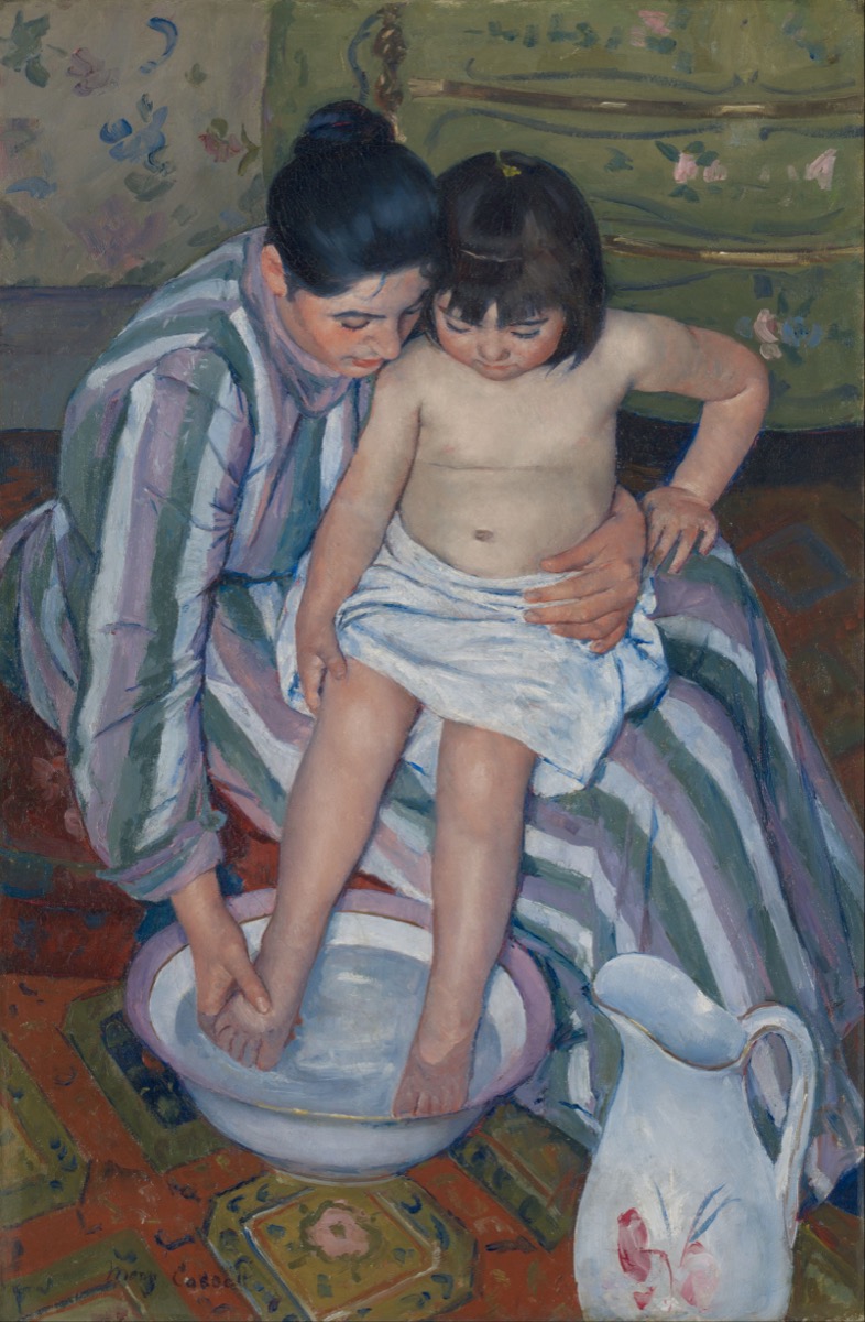
A mother washing a child's feet in a basin. Seen from above, the viewer looks down at the pair as if standing over them. The most radical thing about this painting isn't the subject. It's the angle.
The overhead perspective. Cassatt places the viewer above the scene, looking down, the viewpoint of someone standing in the room. This radical angle came directly from Japanese woodblock prints (ukiyo-e), particularly the work of Utamaro and Hiroshige, which Cassatt encountered at a major exhibition in Paris in 1890. She took the flattened space, the bold decorative patterning, and the elevated viewpoint of Japanese printmaking and applied them to a Western domestic scene. The result eliminates the traditional "painting as window" distance. You're not observing from across a gallery. You're IN the room. You could reach down and touch the water. The intimacy is physical, not sentimental.
The hands. The mother's left hand holds the child's foot with practiced firmness. Her right hand is mid-wash. These are working hands, not performing tenderness for an audience, but DOING something. The tenderness is in the competence. She's done this a thousand times. The repetition hasn't dulled it; it's deepened it into muscle memory. Cassatt paints care as SKILL, not as emotion.
The patterns. The mother's striped dress, the patterned rug, the water in the basin — everything has texture and pattern except the child's skin, which is plain, smooth, undecorated. The child is the one simple thing in a complex world. The compositional effect: your eye rests on the child's body the way the mother's attention does. Cassatt used formal design to mimic the psychology of care.
Use viewpoint to create intimacy. Don't default to eye-level. Looking DOWN on a scene (as if you're standing in the room) eliminates the comfortable distance of traditional composition. Looking UP at a figure gives them power and dignity. The angle you choose isn't just formal, it's emotional. Cassatt's overhead view makes the viewer a participant, not a spectator.
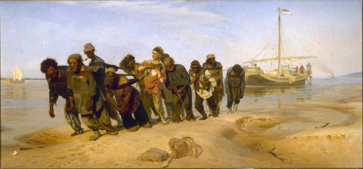
Eleven men yoked together by a single rope, dragging a barge upriver. Every face individual. Every body carrying the same weight differently. The painting Repin spent five years making, and the reason he spent five years is visible in every face.
Eleven individuals, not one crowd. The easy version of this painting would treat the haulers as a mass, "oppressed workers." Repin did the opposite. He spent months with actual haulers, sketching individual faces, learning names and stories. The result: each man is a portrait. The leader is resigned but steady. The young man in the center — the one with the loose strap and the upright posture, hasn't given up yet. The old man on the right is barely conscious. You don't see "labor." You see eleven human beings, each with an inner life, each coping differently with the same burden. That's what five years of looking gets you.
The rope as compositional device. The rope connects all eleven figures into a single diagonal line that crosses the canvas. Your eye follows it from left to right, reading each face in sequence, like reading a sentence. The rope is both literal (they're actually tied together) and formal (it organizes the composition). Remove the rope and the painting falls apart, both as a scene and as a design.
The young man. One figure breaks the pattern. While the others lean forward, bent by the rope, one young man stands straighter, adjusting his strap, looking off to the side. He's the one who hasn't been broken yet. Repin places him near the center of the composition, the fulcrum. He's the painting's question: will he become like the others, or will he escape? The viewer identifies with him because he's the only one who still looks like he has a choice.
In a group composition, individualize every figure AND have one break the pattern. The group establishes the condition (labor, grief, celebration, protest). The individual who doesn't quite fit — the one who's looking the wrong way, standing when others sit, resisting when others comply, is the painting's emotional protagonist. The viewer's eye goes to the pattern-breaker, and their empathy follows.
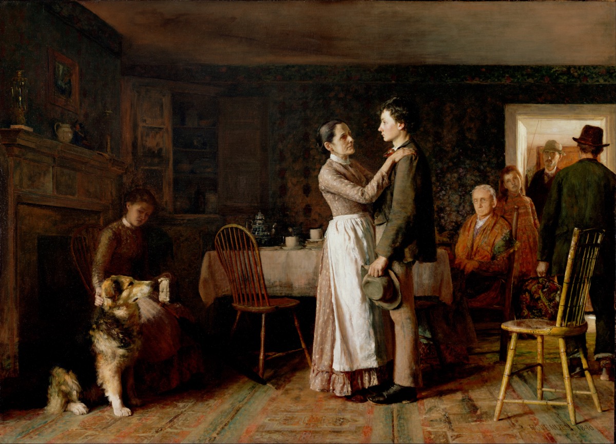
A young man leaving home for the city. His mother holds his arm. His father sits behind them. His sister watches from the side. The dog looks confused. This was the most popular painting at the 1893 World's Columbian Exposition, ten million people saw it, and most cried.
Five people, five different farewells. The mother: desperate, clinging. Her hand on his arm is the center of the painting, the physical connection about to break. The son: already half-gone. His body leans toward the door. His hat is in his hand — ready. He loves her but he's leaving. The father: seated, not participating. He's already accepted it, his body is turned away, looking at the floor. He won't make a scene. The sister: curious, maybe envious. Watching from the middle distance. The dog: the only one who doesn't understand. He's just confused by the suitcase. Hovenden gave every family member their own version of the same event, and all five are visible at once.
The directional tension. The mother pulls LEFT (stay). The son leans RIGHT (go). The composition runs on this tug-of-war. The suitcase and hat point right. The mother's body and the domestic interior point left. The painting is a physical argument between two directions, and the son is the rope.
The specificity. The worn rug. The specific hat. The mother's dress. The dog's breed. Nothing is generic. Ten million people wept at this painting because it looked like THEIR kitchen, THEIR mother, THEIR departure. The universal entered through the specific.
Give every figure in the scene a DIFFERENT reaction to the same event. Don't paint one emotion. Paint five versions of the same moment. The mother grieves. The father accepts. The sibling envies. The child doesn't understand. The viewer picks the reaction that matches their own, and the painting becomes personal to each person who sees it.
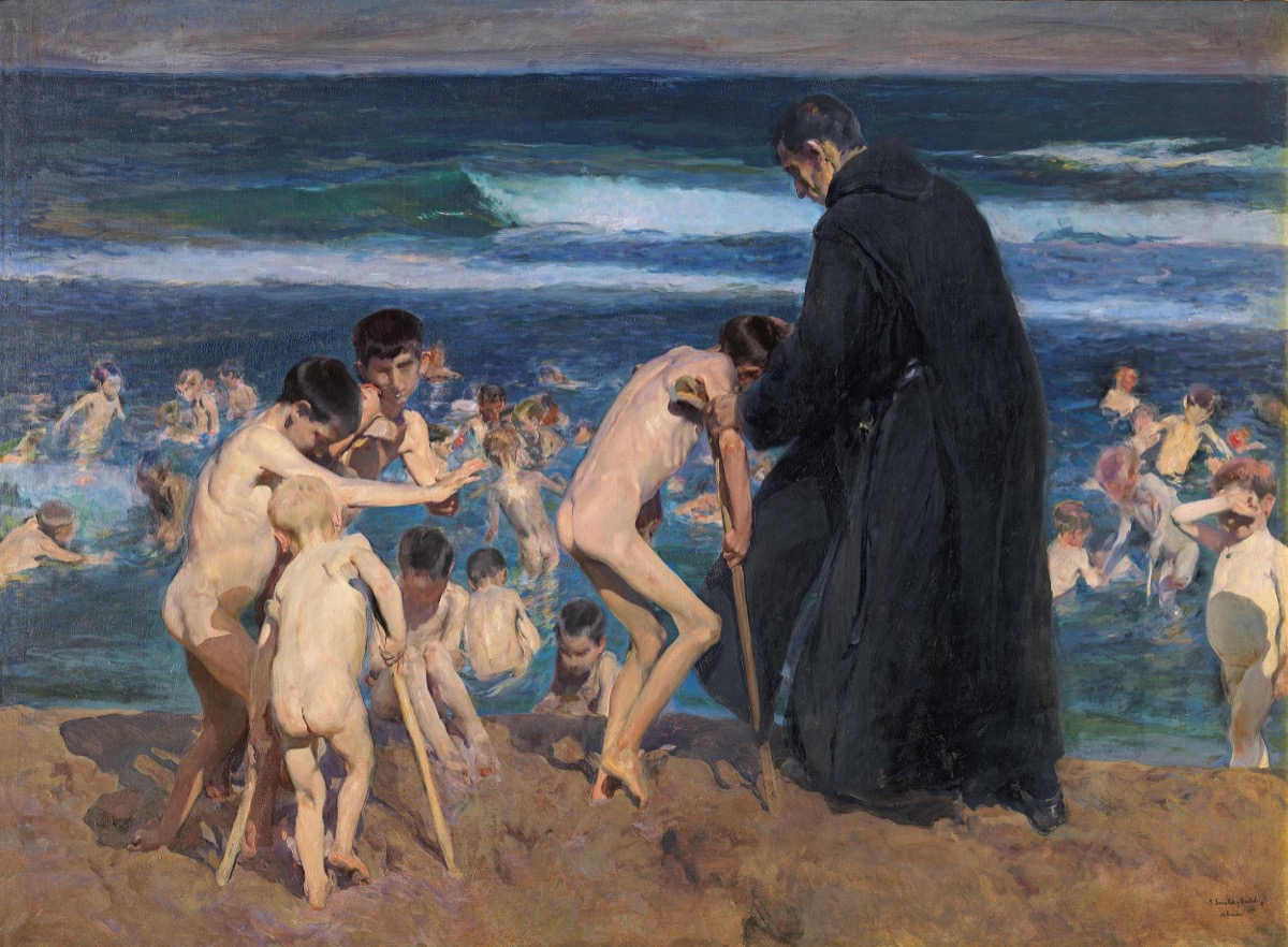
Disabled children bathing in the sea at Valencia, attended by a monk. The light is Mediterranean — warm, brilliant, the light of Sorolla's joyful beach paintings. The subjects are children with polio, rickets, and other diseases. The combination is almost unbearable.
The light doesn't care. This is the same light Sorolla uses in "Children on the Beach", ecstatic, golden, full of life. He doesn't dim it for the disabled children. He doesn't shift to gray or blue for "sad" content. The light is as generous and beautiful as in his happiest paintings. This is the move: the world's beauty is indiscriminate. It falls on suffering and joy equally. The viewer's heart breaks not because the scene is dark, but because it's light, the same light that falls on healthy, running children falls on these children who can't walk. The beauty includes them. The world includes them. Their bodies are different but the light treats them the same.
The monk. A single adult figure in white, helping a child into the water. He's not performing compassion. He's doing a job, carefully, practically, with the unsentimental tenderness of someone who does this every day. His body is bent toward the child the way Cassatt's mother bends toward the bath. Care as daily practice, not as dramatic gesture.
The water. The sea receives the children without judgment. Water is the great equalizer, every body floats the same. Sorolla paints the water as he always does: alive, reflective, generous. The Mediterranean doesn't know these children are disabled. It holds them.
Don't change the light for difficult subjects. Paint suffering in the same beautiful light you'd use for joy. The beauty doesn't diminish the suffering — it intensifies it, because the viewer realizes that the world goes on being beautiful while people hurt. That's more devastating than any darkness. See also: Sargent's golden sunset over blinded soldiers in "Gassed."
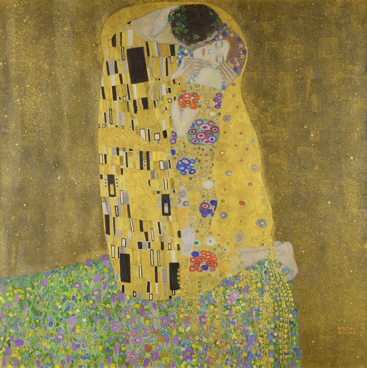
Two figures wrapped in gold, kneeling on a flowered cliff edge, merged in an embrace. The most reproduced painting of romantic love, and it works because it's actually about disappearing.
The figures dissolve. You can barely tell where one person ends and the other begins. The gold cloaks, rendered in actual gold leaf, a technique Klimt borrowed from the Byzantine mosaics he studied in Ravenna in 1903, merge the figures into a single luminous form. The gold carries the weight of sacred art: icons, altarpieces, church ceilings. Klimt applied that sacredness to a secular embrace, elevating the kiss to something holy. The bodies beneath the gold are suggested, not defined — they're becoming one form. This is love painted not as an event but as a STATE: the loss of individual identity in the merge with another person. It's ecstatic and terrifying. You gain everything (union). You lose everything (self).
The cliff. Look at the bottom of the painting. The couple kneels on a flower-covered ledge that drops off into nothing. Below them: the void. The gold background. They're on the edge of an abyss. The embrace is also a clinging. The beauty is also a danger. Klimt paints love as the thing that saves you from the void AND as the thing that brings you to its edge.
The gender in the patterns. His cloak has rectangular, geometric patterns (masculine, hard, ordered). Her cloak has circular, floral patterns (feminine, organic, soft). Where the cloaks overlap, the patterns merge, geometry and organics interweaving. Klimt encoded the union of different-into-one at the level of decorative pattern. Even if you never consciously notice it, your eye reads the merging.
The woman's ambiguity. Look at her body language. Her eyes are closed, her head is turned, her toes curl over the cliff edge. She's receiving the kiss more than giving it, held and enveloped rather than actively embracing. Is this ecstatic surrender or passive acceptance? The painting holds both readings, and the tension between them is part of its power. Pure romantic bliss would be simpler and less interesting. The hint of something more complex, abandon, vulnerability, even a trace of helplessness, is what keeps the painting from being merely decorative.
To paint union, dissolve the boundary between figures. Shared shadow shapes. Overlapping silhouettes. Color that bleeds from one figure into the other. The more two figures read as ONE shape, the more intense the emotional connection reads. And: put the union somewhere precarious — a cliff, a threshold, a moment that can't last. Love without risk is decoration. Love on a cliff edge is Klimt.
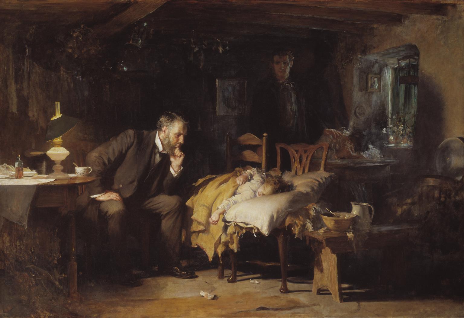
A doctor watches over a sick child in a working-class home. He's not doing anything medical. He's sitting, leaning forward, chin on fist, watching. The child lies on two chairs pushed together. The parents are in shadow behind. Dawn light is beginning through the window. The fever may have broken.
The doctor does nothing. That's the painting. In an era that worshipped science and progress, Fildes painted a doctor who has exhausted his medicine and has nothing left to offer but his presence. He STAYS. He watches. He doesn't leave. The most powerful thing a human being can do for another, be present when there is nothing to fix, is depicted as the painting's central action. Inaction as heroism.
Three zones of light. The lamp on the table illuminates the child (the center of concern). Dawn light through the window touches the doctor's face (hope? or just morning?). The parents huddle in near-darkness behind, the father standing, the mother collapsed on the table. Fildes organized the entire emotional hierarchy through light: what we should look at first (the child), second (the doctor's vigil), and last (the parents' helpless grief in shadow).
The improvised bed. Two kitchen chairs pushed together. A pillow. A blanket. This child doesn't have a bedroom — or the illness was too sudden for the bed. The chairs tell you the family's economic class, the urgency of the situation, and the parent's desperation in a single detail. Fildes could have painted a bed. The chairs are a better painting.
Paint someone doing nothing, and make the nothing be the most important thing in the painting. Waiting. Watching. Being present. The body of a person who is simply THERE for someone else. This is the antidote to every action painting. Sometimes the most heroic gesture is the absence of gesture. Use light to elevate the stillness, illuminate the watcher, not the watched.
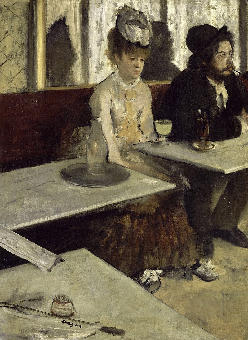
A man and a woman sit in a café. They might be together. They might not. A glass of absinthe sits before her. His drink is darker. They stare in different directions. The café around them buzzes with life they're not part of.
The off-center framing. The two figures are pushed to the upper right of the canvas. The lower left is ALL table, empty marble, newspaper, the zigzag of table edges receding. Degas gave the emptiness more space than the people. The composition itself is lonely: the figures are cornered, squeezed to the edge of their own painting, as if the vacancy is pushing them out.
The eyeline disconnection. She looks down and to the left. He looks right, out of frame. They're pointed in opposite directions. Seated side by side, sharing a table, and occupying completely separate psychological spaces. Degas paints togetherness as the most refined form of isolation: two people who have given up on reaching each other.
The drink. The absinthe glass is the brightest object in the painting — pale green-yellow, catching light. Your eye goes to it before it goes to the faces. Degas made the addiction the visual center and the humans peripheral. That's the hierarchy of an addict's world: the substance is central, the person is marginal.
Push the figures to the edge. Give the emptiness most of the canvas. The traditional instinct is to center the subject. Degas decenters it, and the off-balance composition creates unease. The viewer feels that something is wrong before they've read a single face. Also: make the object of addiction (phone, glass, screen) the brightest thing in the frame. The visual hierarchy tells the psychological truth.
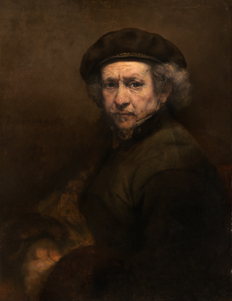
Rembrandt at 53. Bankrupt. His wife dead. His collection sold. He paints himself looking directly at us, no flattery, no costume, no mythological disguise. Just the face. This is what a human being looks like when they've lost everything except the ability to see clearly.
The refusal to idealize. Rembrandt's early self-portraits are dashing, costumes, dramatic lighting, the young artist performing. By 1659, the performance is over. The face is puffy, lined, tired. The nose is bulbous. The skin sags. He paints every flaw with the same attention he gives the eyes — which are the painting's shock. The eyes are utterly alive. Alert. Almost amused. The body has aged. The person behind the eyes hasn't. That gap, between the deteriorating surface and the undiminished interior, is what makes Rembrandt's late portraits the greatest paintings of what it means to age.
The economy. The background: nothing. A warm dark. The clothing: a dark smock, barely articulated. All the paint, all the attention, all the light is on the face and hands. Rembrandt eliminated everything that isn't essential. What's left is irreducible. A face, a gaze, a human being in a dark room, looking at you and daring you to look back with the same honesty.
Eliminate everything that isn't the face. Dark background. Simple clothing. No props. No setting. Force the viewer to confront the person with zero distraction. This works for portraiture when you want maximum psychological impact, the face is the story, the paint is the language, and nothing else is allowed to compete. The courage isn't technical. It's the courage to show a face without flattery.
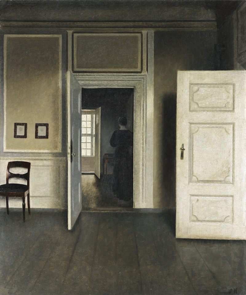
A woman stands in a room with her back to us. Gray walls, a table, a door slightly ajar. That's the entire painting. Hammershøi painted variations of this scene — the same apartment, the same woman (his wife Ida), the same turned back, for twenty years. It's among the most haunting paintings of domestic solitude ever made.
The turned back. Like Wyeth's Christina, we never see the face. But where Christina's back radiates yearning (she's reaching for the house), Ida Hammershøi's back radiates... nothing readable. She's just standing. Or walking away. Or pausing between tasks. The refusal to give us a facial expression forces us to PROJECT, and what we project is usually our own experience of standing alone in a room, thinking about nothing, being nobody's audience. The painting mirrors the viewer's private, unobserved self.
The gray. Hammershøi drained his palette to near-monochrome. The walls are gray. The light is gray. The dress is gray-black. The table is gray-brown. This isn't depression, it's ACCURACY. Most rooms, most of the time, in northern light, look exactly like this. By stripping the color, Hammershøi strips the drama. What's left is the actual texture of daily domestic life, not its highlights, not its crises, just its ongoing, unwitnessed quiet.
The doors. In almost every Hammershøi interior, a door is visible — usually ajar. It leads to another room, equally quiet, equally gray. The door promises that there's more to the apartment, more rooms, maybe more people, but the promise is empty. The rooms behind the doors are as vacant as the room we see. The architectural depth creates psychological depth: layer after layer of emptiness.
The figure with the back turned, in a room with an open door. The turned back withholds the face (universalizing). The open door creates depth and the suggestion of elsewhere. Together they produce the feeling of a life that extends beyond the frame in all directions, and is quiet in every direction. For painting solitude, this is the most efficient composition ever devised. Also: don't be afraid of gray. Stripping the palette strips the sentimentality.
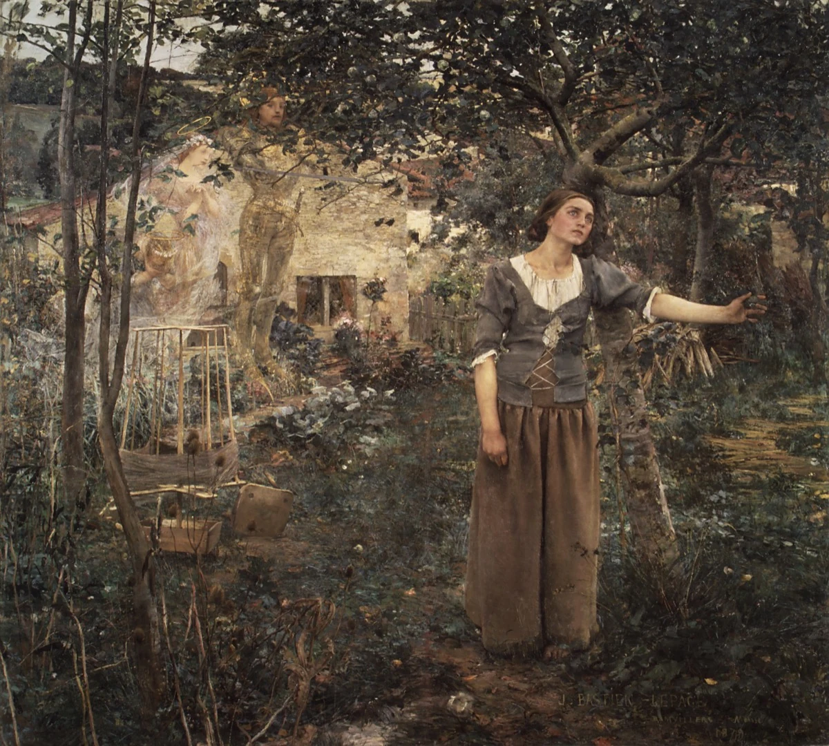
Joan stands in her parents' garden, one arm extended, eyes unfocused. Behind her, three ghostly saints appear — barely visible, almost photographic blur. She's hearing voices. She hasn't decided whether to answer yet. The most famous threshold moment in art.
Two realities in one frame. The garden is painted with obsessive naturalism, every leaf, every twig, the specific texture of the cottage wall. It's real. You can smell it. The saints behind her are painted in a completely different style, transparent, dissolved, like a double exposure. They're NOT real. Or they're a different kind of real. Bastien-Lepage puts both rendering styles in the same painting, and the collision between them IS Joan's experience: a girl standing in her real garden hearing an unreal voice. The technique embodies the subject.
The extended arm. Joan's left arm reaches forward and slightly upward, toward the saints, or toward nothing, depending on whether you believe her. The arm is the painting's hinge: is she reaching for the divine, or is she a troubled girl gesturing at air? Bastien-Lepage doesn't answer. The ambiguity is the painting's power. In 1879, this was a painting about faith. In 2026, it's a painting about anyone who hears a calling that others can't verify.
The bare feet. Joan is barefoot in the garden. She's not yet a soldier, not yet a saint, not yet anything but a peasant girl in the dirt. The bare feet ground her, literally — in the ordinary world she's about to leave. Every detail of her body says "normal person." The voices say otherwise. The gap between the ordinary body and the extraordinary summons is unbearable.
Mix rendering styles to show inner and outer reality. Paint the physical world in sharp, grounded realism. Paint the psychological or spiritual element in a different register, softer, more transparent, less resolved. The shift in technique tells the viewer: this part is the inner world. You don't need symbols or allegory. The paint itself signals the shift. Also: the extended hand reaching toward something the viewer can't quite see is the universal gesture of calling, desire, and threshold.
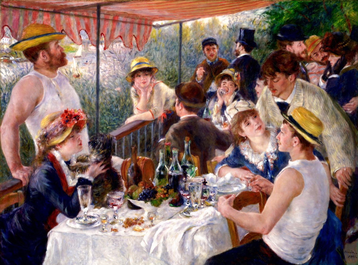
Fourteen people on a restaurant terrace by the Seine. Eating, drinking, talking, flirting. Every person in the painting was a real friend of Renoir's. His future wife holds the little dog at lower left. The afternoon light filters through the awning. It is, quite possibly, the happiest painting ever made, and it works because the happiness is SPECIFIC.
The web of gazes. Map who's looking at whom. The man in the top hat looks at the woman beside him. She looks at the man leaning on the rail. He looks out at the river. The woman with the dog looks at the dog. The man in the straw hat talks to a woman who's looking elsewhere. NOBODY is looking at the same person who's looking at them. Renoir created a web of unrequited attention, every gaze crosses every other gaze — and the result, paradoxically, is a feeling of total social warmth. Everyone is interested in someone. Nobody is alone. The net of crossed gazes holds them all together.
The still life as emotional anchor. The table in the foreground is covered with the debris of a long meal, wine bottles, fruit, glasses, crumpled napkins. These objects are painted with as much love as the faces. The still life tells you: this has been going on for hours. Nobody wants to leave. The meal is over and the afternoon stretches. The objects are evidence of sustained pleasure.
Everyone is real. Renoir didn't use professional models or invent characters. These are his actual friends at their actual restaurant on their actual afternoon. The specificity, this woman's specific hat, that man's specific undershirt, the specific dog, is why the painting doesn't feel sentimental. It's not "a happy gathering." It's THIS happy gathering, on THIS afternoon, and it will never happen again exactly this way. The joy is real because the moment is real. And because it's real, it's already passing.
In a group celebration scene, make every gaze go to a DIFFERENT person. No two people looking at each other. The web of crossed attention creates warmth more effectively than direct eye contact (which reads as a single relationship, not a community). Also: paint the table. The still life debris of a long meal, the bottles, the crumbs, the pushed-back plates — is evidence of sustained joy. It's the aftermath of happiness, which is more convincing than happiness itself.
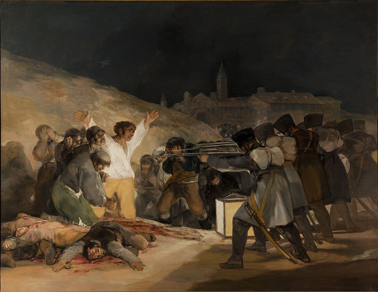
French soldiers execute Spanish civilians by lantern light. The central figure, white shirt, arms raised, faces the rifles with a mix of terror and defiance. The soldiers are faceless, a wall of uniforms. The hill behind is dark. The dead are already piled at the man's feet. The next volley will add him to the pile.
The asymmetry of identity. The victims have FACES. Each one is individual, this one screams, that one covers his eyes, this one prays. The soldiers have NO faces. They're a row of identical backs, identical uniforms, identical rifles. Goya stripped the killers of personhood and gave the victims maximum personhood. This is the painting's moral argument, made entirely through compositional choice: violence dehumanizes the perpetrators, not the victims.
The lantern. A single large lantern sits on the ground between the soldiers and the civilians, casting light on the victims and leaving the soldiers in silhouette. The light reveals the faces that are about to die and hides the faces that do the killing. Goya made light itself a moral actor: it sides with the victims.
The white shirt. Among the browns and blacks of the night, the central figure's shirt is white — almost glowing. It's a target. He's the most visible person in the painting, the most exposed, the most vulnerable. And his arms are raised in a pose that echoes the crucifixion, whether consciously or in pure animal surrender. Goya gives the anonymous civilian the visual language of Christ without making it explicit. The echo is felt, not stated.
Give faces to the vulnerable and remove faces from power. When painting any scene of imbalanced power, a system crushing an individual, authority confronting a person, the faces should be on the powerless side. The powerful side can be faceless, turned away, institutional, uniform. This reversal of the expected hierarchy (we usually want to see the powerful) forces the viewer to identify with the vulnerable. Also: one bright element in a dark scene the white shirt, the single illuminated face — concentrates all empathy on one figure.
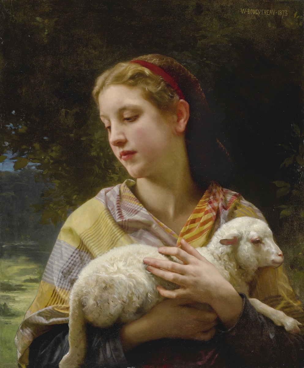
A young woman in a peasant dress cradles a lamb in her arms. That's all, a girl and a lamb, the Agnus Dei, innocence holding innocence. No narrative, no drama. Pure presence. And it's devastating, because Bouguereau paints the human body with such reverence that looking at the painting feels like being in the room.
Presence mode. This is not a narrative painting. Nothing is "happening." There's no tension, no moment, no before-and-after. It works in what we've called "presence mode", the painting exists to show you a human being rendered with total attention and skill. The subject is the subject. The craft is the statement. The message is: "I looked at this person with everything I had, and here is what I saw."
The skin. Bouguereau's rendering of the woman's skin — the warmth of her face, the softness of her arms against the lamb's wool, the play of light across form, is among the most technically accomplished in art history. It's not photographic. It's BETTER than photographic. The skin breathes. It has depth, you see blood beneath it. And the contrast between her living skin and the lamb's soft fleece gives each texture more reality by proximity to the other. This is what 10,000 hours of training can achieve: surfaces that the viewer perceives as alive. The technique isn't showing off. It's service, the painter is serving the subject by rendering them with the maximum possible truth.
The permission. In a contemporary art world that often treats beauty as suspicious, Bouguereau's unashamed commitment to making something beautiful is itself a statement. The painting gives the viewer PERMISSION to simply enjoy looking at a beautifully rendered human being. That's not a lesser experience. For many viewers, it's the experience they need most and get least.
Not every masterwork needs a story. Sometimes the mastery IS the message. The stealable move here isn't compositional, it's attitudinal: give yourself permission to paint beauty without narrative justification. A beautifully painted figure IS a contribution. The skill honors the subject. The viewer receives the honor as a gift. That's enough. That's always been enough.
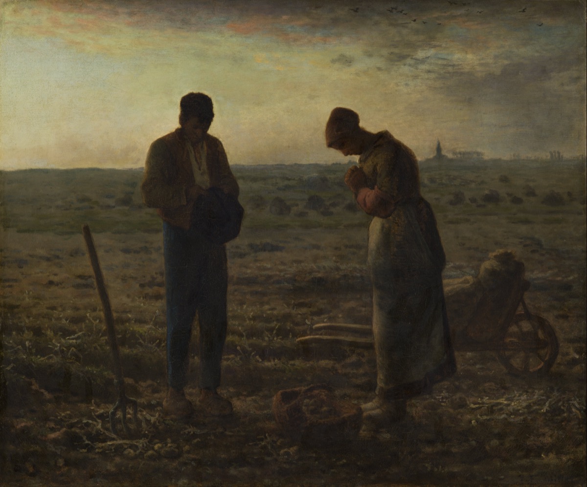
Two peasants in a potato field at sunset. They've stopped working. Somewhere in the distance, a church bell is ringing the Angelus, the evening prayer. They bow their heads. The wheelbarrow, the fork, the basket of potatoes sit idle. For this one moment, the labor stops and something else fills the space.
The pause. Everything in the painting says "work", the tools, the turned earth, the heavy clothing, the baskets. And everything in the figures says "stop." They've interrupted the most essential activity (feeding themselves) for the most non-essential activity (prayer). The painting is the GAP between the labor and the prayer, the moment where survival yields to spirit. Neither is more important. Both coexist.
The horizon. The horizon line is very low, the sky takes up two-thirds of the painting. The figures are small against it. The church steeple in the far distance is barely visible. The bell they're responding to is a sound, not a sight. The sky dwarfs everything — the people, the church, the field. The scale says: the sacred is larger than any of us, larger than our labor, larger than our institutions. It arrives as sound from far away, and two people in a field pause for it. That's enough.
The two bows. The man holds his hat to his chest, head bowed. The woman's hands are clasped. They're not identically posed, he's more rigid, she's more inward. They pray differently. They pray together. Millet paints the SHARED practice, two people doing the same thing in their own way, at the same time, in the same field. That's communion. Not a church, not a ritual, not a priest. Two people. One bell. One silence.
Paint the pause, not the action. The moment when everything stops. The silence between the notes. The breath between tasks. More sky than ground, more space than figure. Let the composition be mostly emptiness, and let the small figures be the anchor in that vastness. The sacred doesn't require dramatics. It requires stillness and scale.
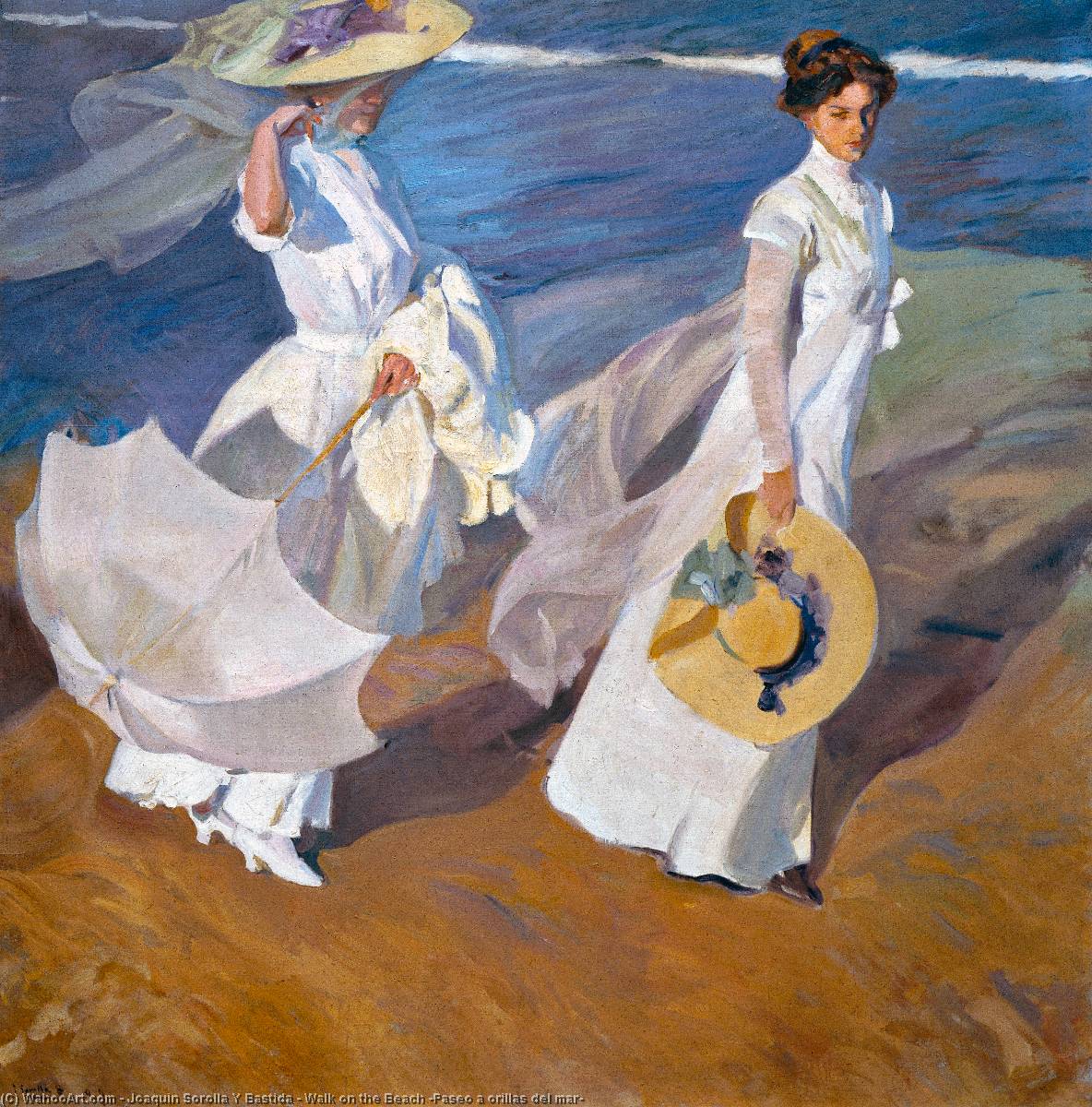
Two women in white dresses walk along a beach. Wind catches their skirts and scarves. The light passes through the fabric. The wet sand reflects their figures. The brushwork is so loose it dissolves into pure light if you stand too close, and snaps into perfect clarity from six feet back. This is Sorolla at maximum power — the painter of light at the top of his game.
The light through fabric. Sorolla's technical obsession was light passing THROUGH things, cloth, water, skin. The white dresses are not painted white. They're painted with the colors of what's behind them: the warm sand, the blue sky, the reflected sea. The fabric becomes a screen on which the whole environment projects itself. This is technically among the hardest things in painting, rendering transparent, light-filled cloth in a single session, and Sorolla does it with visible joy.
The movement. Everything is in motion. The scarves stream. The skirts billow. The reflections shimmer. The shadows shift. And yet the painting is frozen. Sorolla captures movement so convincingly that you feel the wind on your face. The trick: loose, directional brushwork that FOLLOWS the movement, each stroke aligned with the direction of the wind, the drape of fabric, the ripple of wet sand. The brush moves the way the world moves.
The absence of story. There is no narrative. No tension. No pain point. No allegory. Two women walk on a beach. The light is beautiful. That's it. And it's enough. This is painting in pure presence mode — the painter showing you a moment of the world rendered with such attentiveness and skill that the looking itself becomes transcendent. The "story" is: beauty exists. Right now. In light on cloth on a beach on a Tuesday. That IS the masterwork.
Align your brushwork with the movement of the subject. Strokes that follow the drape of cloth. Strokes that follow the direction of light. Strokes that follow the curve of reflected form on water. When the brush moves the way the world moves, the painting feels alive, because the viewer's eye reads the brushwork as motion, even in a still image. This is the technical foundation of Sorolla's luminosity: the brush isn't depicting light, it's BEHAVING like light.
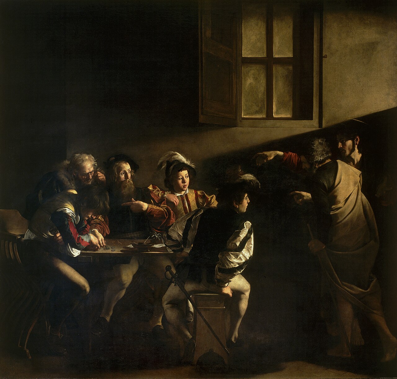
A group of men sit around a table counting money. Christ enters from the right with Peter and points at Matthew. A shaft of light follows the gesture. Matthew points at himself, "Me?" The most dramatic use of light and gesture in Western art, and the invention of a visual grammar that film directors still use.
The light IS the finger. Christ points at Matthew. The light falls in the same direction, from upper right, cutting diagonally across the scene. The divine call and the physical light are the same force. You don't need to know the Bible story to read this painting. The light tells you: something has entered this room and chosen this person. Caravaggio made the invisible (calling, grace, destiny) visible by making it LIGHT. Every painting since that uses a dramatic shaft of light to pick out a figure owes something to this room.
The costumes. The tax collectors wear contemporary 1599 clothing — doublets, feathered hats, the fashion of Caravaggio's Rome. Christ and Peter wear timeless robes. The anachronism is deliberate. The sacred enters the ordinary. This isn't a historical event from 33 AD, it's happening NOW, in YOUR tax office, to people who look like you. Caravaggio collapsed the distance between biblical past and Roman present, and the painting became timeless because of it.
"Me?" Matthew's gesture, pointing at himself, chin ducked, brow raised, is the universal gesture of "You can't mean me." The disbelief of being chosen. The hesitation before accepting. It's the same gesture a person makes when they're offered a promotion they don't feel ready for, or when someone says "I love you" and they can't believe it. Caravaggio found the one gesture that translates across centuries.
Use a single shaft of directed light as a narrative actor, the light points, chooses, reveals. What the light touches is what's being called, chosen, or transformed. What stays in shadow is the old life, the unchosen, the before. Also: set mythic or universal stories in contemporary clothing and settings. The sacred doesn't need period costume. It enters the room you're already in.
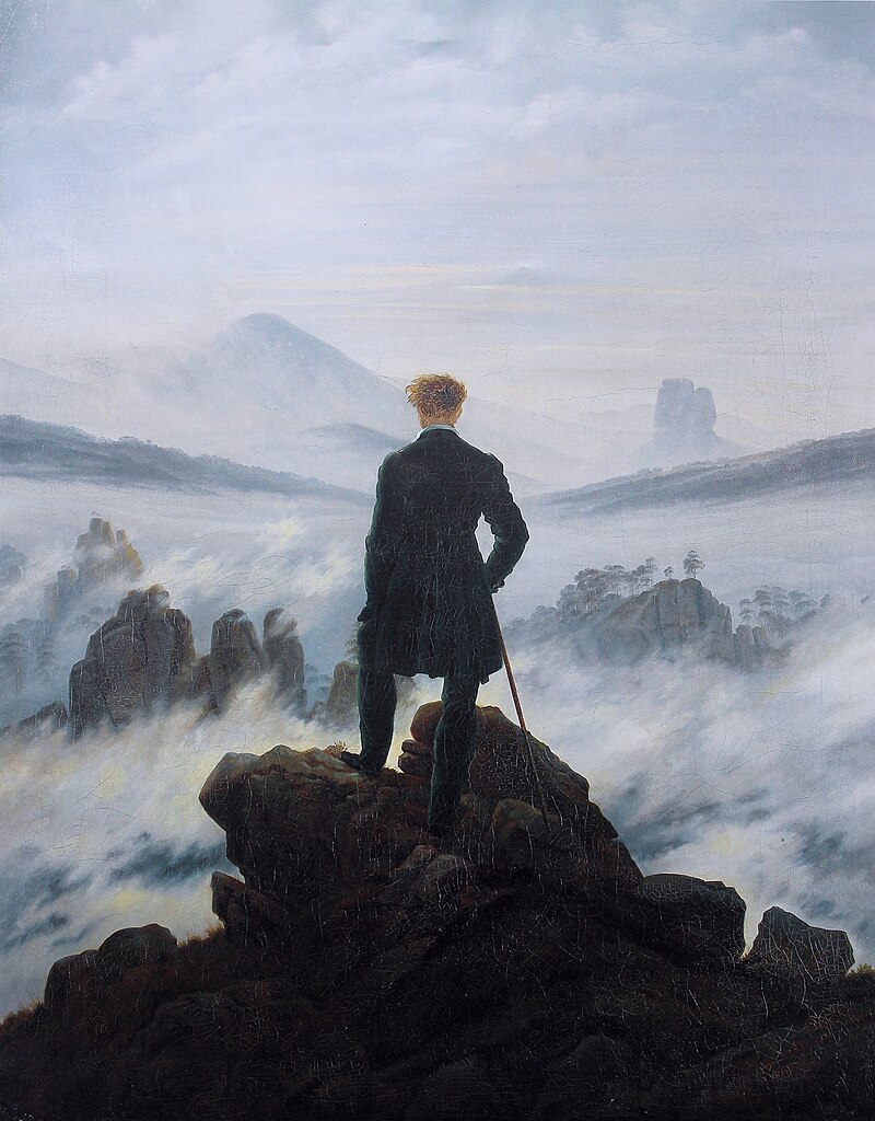
A man in a dark coat stands on a rocky outcrop, back to the viewer, looking out over a vast landscape of mountains and fog. The most reproduced Romantic painting. The original figure-in-nature composition that every Instagram hiker unconsciously recreates.
The back. We see what the figure sees, but not who the figure is. Like Wyeth, like Hammershøi, the turned back universalizes. Every viewer becomes the wanderer. Your experiences, your longing, your sense of the sublime get projected onto that dark silhouette. Friedrich understood: the face would LIMIT the painting to one person's expression. The back makes it every person's experience.
The scale relationship. The figure is small but not tiny, about one-sixth the canvas height. He's significant (centered, upright, dark against light) but dwarfed (the landscape extends in every direction, the fog erases the ground). Friedrich calibrated the ratio precisely: big enough to identify with, small enough to feel the vastness. This IS the formula for the sublime, the individual confronting something larger than themselves.
The fog. We can't see the ground. The landscape is partially obscured, partially revealed. Mountains emerge from mist; valleys are hidden. Friedrich gives us enough to sense the scale and enough mystery to prevent us from mapping it. The fog is the painting's content: the unknown. The wanderer stands at the edge of the known and looks into what can't be known. That's the human condition, painted as weather.
Figure small, world vast, back turned. The formula for any painting about a person confronting something larger than themselves, nature, mortality, the future, the unknown. The back turned means the viewer sees what the figure sees and projects their own feelings. The scale ratio (figure ~1/6 of canvas) creates the feeling of being significant but overwhelmed. The partially obscured landscape (fog, darkness, distance) preserves the mystery.
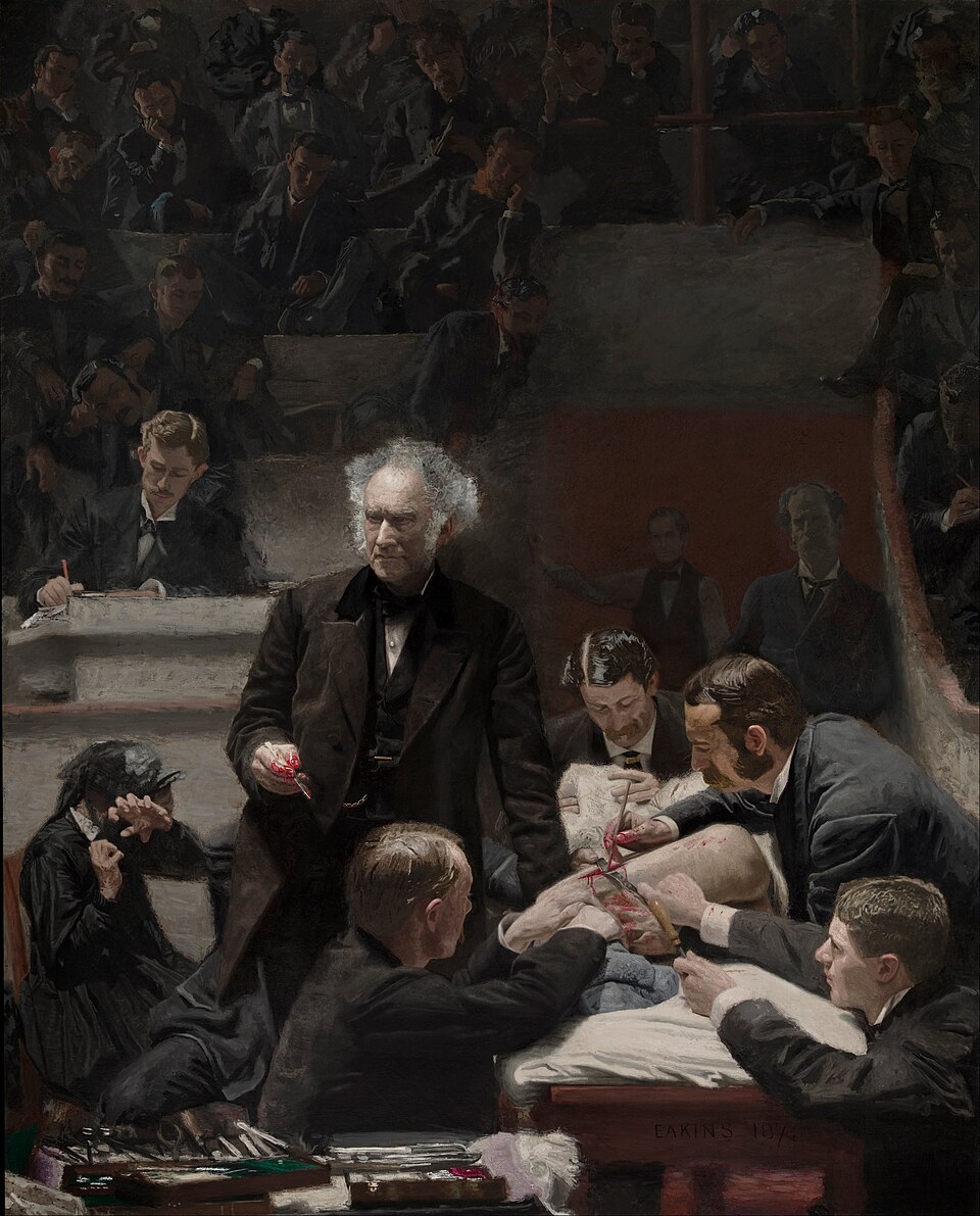
Dr. Samuel Gross pauses during surgery to lecture to a theater of medical students. His hand, holding a bloody scalpel, gestures toward the patient. The mother of the patient recoils in the middle ground, the only person in the room showing emotional distress. Everyone else is focused, clinical, professional. Knowledge and suffering in the same room.
The two kinds of looking. Everyone in the painting is looking at the surgery, the students, the doctors, the scribe. They see a medical procedure. One person, the mother — sees her child being cut open. Same scene. Two completely different experiences. Eakins puts both in the same painting and lets the viewer feel the gap between professional detachment and personal anguish. The painting asks: which kind of looking are YOU doing? Are you here to learn, or to feel?
Gross's hand. The bloody hand, catching the light, is the visual center of the painting. It holds knowledge (the scalpel, the skill, the science) AND violence (the blood, the opened flesh). Eakins puts these together in a single hand, in a single shaft of light, and refuses to separate them. Progress requires cutting. Healing requires harm first. The bloody scalpel is the emblem of every difficult truth.
The theater as composition. The medical theater, rows of students rising into darkness, is also a formal device. The painting has the structure of a Renaissance altarpiece: the central figure below (Gross as secular saint), the witnesses above (students as congregation), the suffering patient at the bottom (the body that makes the sermon possible). Eakins borrowed the structure of religious painting for a secular subject, and the borrowed gravity makes the science feel sacred.
Put two kinds of emotional response to the same event in the same painting. The professional and the personal. The analytical and the visceral. The crowd that watches calmly and the one person who can't. The gap between the two responses IS the painting's tension. Also: borrow the compositional structure of a different genre (altarpiece structure for a medical scene, history painting format for a kitchen, still life arrangement for personal objects). The borrowed structure lends gravity the subject doesn't inherently carry.
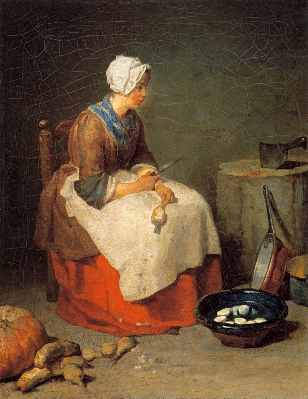
A woman in a white cap pauses while preparing food. She's half-turned, looking at something we can't see — or at nothing. On the table: vegetables, a copper pot, a knife. The most ordinary scene imaginable, rendered with enough attention to make you realize that "ordinary" is a failure of perception, not a property of the world.
The democracy of attention. Chardin gives the copper pot the same quality of light and paint as the woman's face. The turnip is as carefully observed as the hand that holds it. There is no hierarchy of importance, everything in the painting receives the painter's full attention. This is radical. Most painters attend more carefully to faces than objects, to heroes than servants, to the dramatic than the mundane. Chardin refuses all hierarchy. The result: the viewer's eye is taught to see EVERYTHING as worthy of attention. You leave this painting seeing the world differently, for about an hour, until the habit of ignoring things reasserts itself.
The pause. Like Millet's Angelus, the power is in the STOP. The woman has paused mid-task. The knife is down. The vegetables are half-prepared. Something interrupted her, a thought, a sound, a moment of being elsewhere. This tiny pause is the painting's human content. The rest is still life. The pause is the life.
Give every object in the painting the same quality of attention as the figure. Don't rush the background. Don't shorthand the table. Paint the turnip like you'd paint a face. The democracy of attention, treating the humble with the same reverence as the elevated — is a moral position expressed as technique. It's also what separates a painting from a photograph: the photograph captures everything equally by default. The painter CHOOSES to attend equally, and that choice is visible.
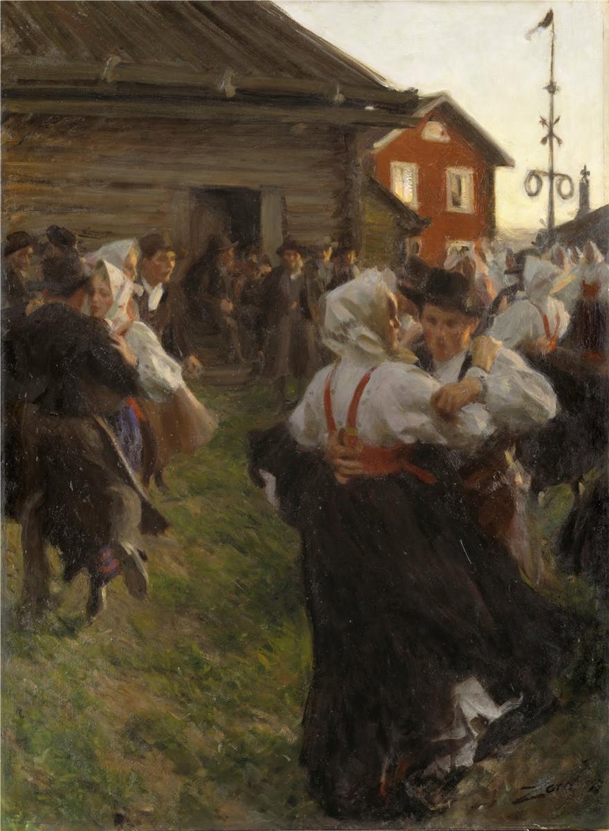
A village midsummer celebration. Couples dance on packed earth beneath the long, golden, never-quite-dark light of a Swedish June night. Zorn was famous for working with a severely limited palette, primarily yellow ochre, cadmium red, ivory black, and white. While pigment analysis shows he wasn't rigidly restricted to those four (he'd reach for other colors when needed), the dominance of this warm, limited set is what gives his paintings their extraordinary unity of mood.
The limited palette as warmth. Four colors shouldn't be enough. But Zorn's specific four, warm yellow, warm red, cool black, and white, produce an entire range of skin tones, fabric colors, earth, and sky, all unified by their shared DNA. Every color in the painting is related to every other color because they all come from the same four tubes. The result: a harmony so complete that the painting FEELS warm before you've registered anything else. The palette IS the mood.
The communal geometry. The dancers form a loose, rotating circle. Around them, spectators stand in clusters. Zorn organized the entire composition as concentric rings — dancers at the center, watchers in a wider ring, buildings in the widest ring. The geometry says "community", layers of involvement radiating from a shared center. Nobody is outside the rings. Everyone belongs.
The visible brushwork as energy. Zorn's strokes are loose, confident, physical, you can see the speed and pressure of each mark. The brushwork matches the dance: rhythmic, energetic, slightly wild. The paint moves the way the dancers move. The technical exuberance IS the celebration. If Zorn had painted this tightly and smoothly, the dance would feel frozen. The looseness keeps it alive.
A limited palette unifies mood. Try Zorn's four (yellow ochre, cad red, ivory black, white) or any equally restricted set. Fewer colors = more harmony = stronger emotional coherence. Also: concentric composition for community scenes. Rings of involvement radiating from a center. The geometry of belonging. And: match your brushwork energy to the scene's energy. Quiet scenes = quiet brush. Celebration = the brush should dance too.
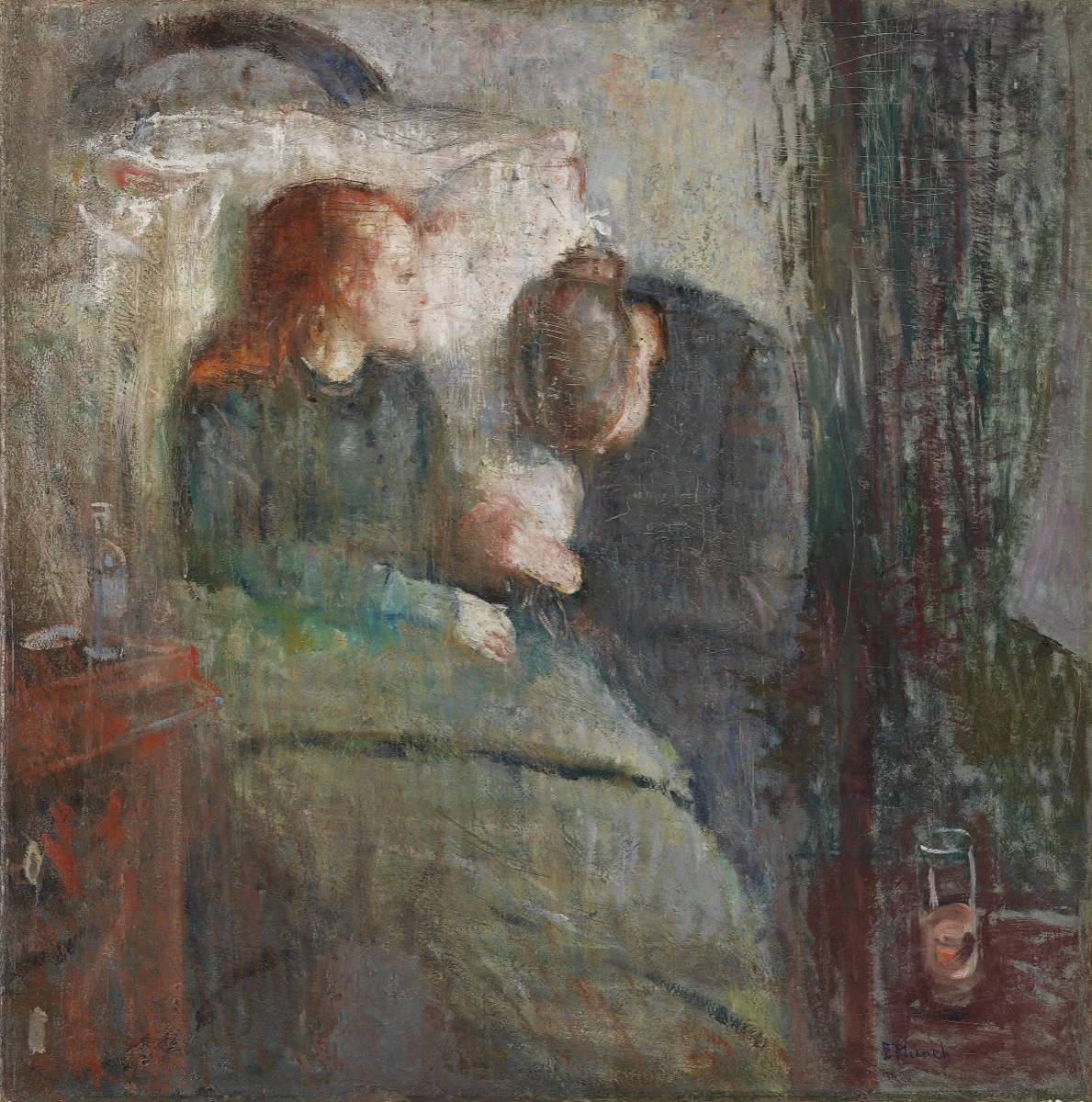
A girl sits propped up in bed, face turned toward the light. A woman, her mother or aunt — sits beside her, head bowed, holding the child's hand. The paint surface is ravaged, scratched, scraped, repainted, scarred. Munch reworked this canvas for over a year, and the struggle is visible in every inch. The painting is about his sister Sophie, who died of tuberculosis at 15.
The destroyed surface. Munch didn't polish this painting. He scraped it, scratched into wet paint with the brush handle, repainted and scraped again. The surface looks wounded, scoring marks cross the faces, the background is gouged. This wasn't incompetence. It was desperation. Munch was trying to get the painting to feel the way grief feels, and grief doesn't feel smooth. It feels raw, reworked, never quite resolved. The technical "failure" (by academic standards) IS the emotional truth.
The two heads. The composition reduces to two heads: the child's, pale and turned toward the light (the future she won't have), and the mother's, bowed toward the child's hand (she already knows). The heads are at the same height but pointed in opposite directions. One faces the light. One faces the dark. The diagonal between them, across the child's pillow — is the line between hope and grief, between the dying and the watching.
The green pillow. The pillow behind the child's head is the most vivid element in the painting, a sickly, institutional green that makes the child's pale face look even more drained. Every hospital pillow is this green. Munch turned a mundane detail into an emotional signal: the color of illness, the color of institutional care, the color you see in nightmares about hospitals for the rest of your life.
Let the paint surface carry emotional information. Smooth paint says "composed." Rough, scraped, reworked paint says "struggled." The handling of the medium is itself a narrative. If the subject is painful, the surface can be painful. If the subject is tender, the surface can be tender. Don't default to polish, choose the surface that serves the feeling. Also: one specific, vivid color detail (the green pillow) anchors an otherwise muted painting and gives the viewer something visceral to hold.
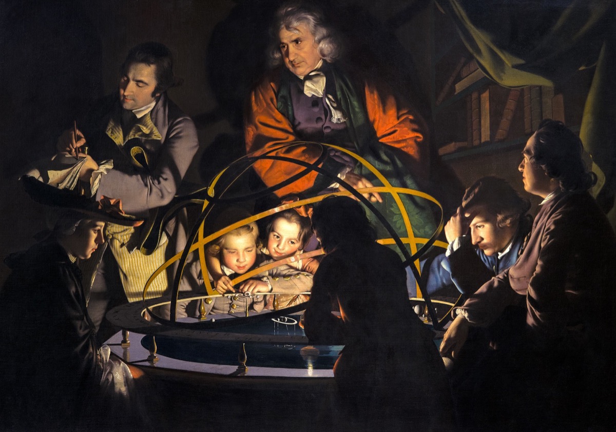
A group gathers around a mechanical model of the solar system. A lamp at the center (representing the sun) illuminates their faces from below. The philosopher explains the cosmos. The audience, old men, young women, children — listen with expressions indistinguishable from religious awe. Science lit by a single lamp. Knowledge as candlelight ritual.
Science painted as sacred mystery. Wright uses the EXACT lighting setup of a Nativity painting, a single central light source illuminating faces gathered around it in darkness. He transplants the visual language of religious painting onto a scientific demonstration, and the result is: science feels sacred. The faces in the light of reason look exactly like faces in the light of God. Wright makes the argument visually: the capacity for awe is the same, whether the object is divine or mechanical. The human need for wonder is the constant. The content changes; the awe doesn't.
The variety of response. Around the orrery: a child too young to understand but mesmerized by the light. A young woman with her face half-turned, between curiosity and fear. Two old men leaning in, analytical. A boy silhouetted against the lamp. Each figure represents a different relationship to knowledge. The painting is a GROUP PORTRAIT OF HUMAN CURIOSITY, and every viewer finds themselves in one of the faces.
Light a secular scene with sacred painting techniques. A single light source from below or center. Faces emerging from darkness. The visual structure of a candlelight Nativity or a Caravaggio applied to a classroom, a lab, a screen. The borrowed structure makes the ordinary feel numinous. Also: ring a central object with figures who each respond differently. The variety of responses is the painting, not the object at the center.
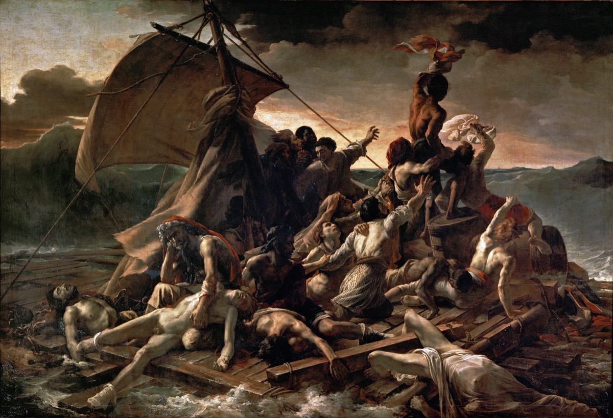
A raft of survivors from the shipwreck of the Méduse, adrift for 13 days. Of 147 people who boarded the raft, 15 survived. Géricault chose to paint the moment when a ship is spotted on the horizon — the apex of desperate hope. The painting is 16 by 23 feet. It's an assault.
The diagonal of hope. The composition builds from the lower left (the dead) through the middle (the dying) to the upper right (a figure waving a cloth at the distant ship). It's a diagonal of ascending hope, from death to life, from despair to possibility. Your eye climbs the raft the way the survivors climbed toward rescue. The formal composition enacts the emotional narrative: the ascent from nothing toward something.
The dead at the base. Géricault doesn't hide the cost. The bottom of the painting is a tangle of corpses, limbs splayed, faces slack. You have to look THROUGH the dead to see the living. The hope at the top of the painting is built on a foundation of bodies. This is the painting's moral structure: survival isn't clean. It requires stepping over those who didn't make it.
The tiny ship. The ship on the horizon is almost invisible, a speck, a fleck of paint. You have to search for it. Many viewers miss it entirely. This is deliberate. The hope that drives the entire composition, 15 survivors straining toward it — is barely there. It might be a cloud. It might be imagined. Géricault paints hope as a near-hallucination: real enough to reach for, too small to be certain.
Build a diagonal from the worst to the best. Dead at the bottom, hope at the top. Despair on the left, action on the right. The composition climbs, and the viewer's emotional state climbs with it. Also: make the object of hope very small. The smaller the ship on the horizon, the more desperate and more human the reaching becomes. If rescue were obvious, there'd be no painting. The uncertainty IS the drama.
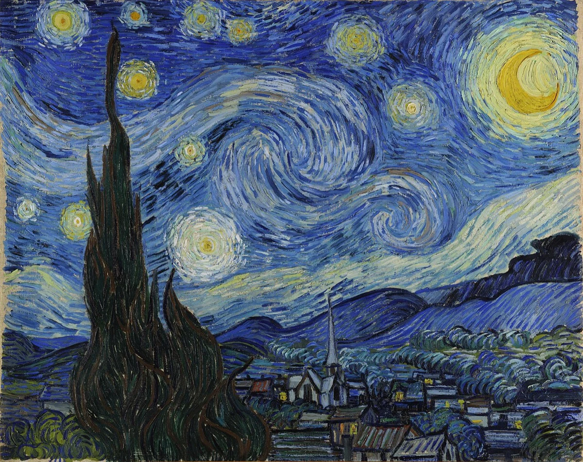
A swirling night sky over a sleeping village. Cypress trees flame upward. Stars pulse with halos. The moon blazes. The village below is quiet, orderly, domestic. Above it: the cosmos in ecstatic, terrifying motion. The most recognized painting on earth, and one of the least understood.
Two worlds, one frame. The village is painted with relative calm, horizontal lines, small neat buildings, a church steeple. The sky is painted with violent, swirling energy, spirals, impasto, flame-like forms. Van Gogh put the rational and the irrational in the same painting. Below: the human world of order, sleep, shelter. Above: something vast, incomprehensible, alive. The village doesn't know what's above it. The viewer sees both. That vertigo — between the safe ground and the ecstatic sky, is the painting's emotional content.
The cypress. One element connects the two worlds: the dark cypress tree that rises from the ground into the sky. It's rooted in the village and touches the stars. It's the only thing in the painting that belongs to both realms, the earthly and the cosmic. It flames upward like dark fire. The cypress is traditionally a symbol of death and eternity. Here it's a bridge: the natural world reaching from the human toward the infinite.
Van Gogh painted this from a mental asylum. He was in Saint-Rémy-de-Provence, recovering from a breakdown. The landscape, the rolling hills, the valley, the village, is based on the pre-dawn view from his east-facing window, which he wrote about to his brother Theo. But the sky is pure invention: the swirling spirals, the pulsing star halos, the violent energy overhead are not what he saw but what he FELT when he looked up. The church steeple resembles a Northern European spire more than anything in Provence — a memory of home injected into a French landscape. The painting is part observation and part hallucination, and Van Gogh doesn't distinguish between them. That's the point. The line between seeing and feeling, between the rational village and the ecstatic sky, doesn't exist for him, and in this painting, it doesn't exist for us either.
Split the painting into two registers with different painting styles. Calm below, turbulent above. Tight rendering for the controlled world, expressionistic handling for the emotional world. Let the technique itself signal the shift between rational and irrational, between the world as it is and the world as it FEELS. Also: one vertical element connecting both registers the cypress, the steeple, the figure standing between two worlds.
A working man stands at a town meeting, speaking. He wears a leather jacket while those around him wear suits and ties. He's the only one standing. Everyone else is looking up at him, listening. His face shows the effort of speaking in public. His hands rest on the bench in front of him. A folded newspaper sticks from his pocket. An ordinary person, exercising an extraordinary right.
The class contrast. The speaker is visibly working-class — leather jacket, rough hands, no tie. The listeners wear suits. The contrast says: this man's opinion counts the same as theirs. The painting doesn't argue for democracy. It SHOWS it, in the specific, physical fact of a working man standing while men in better clothes listen. Rockwell understood: you don't paint ideas. You paint bodies in relation to each other, and the idea emerges from the relationship.
The vertical figure. Everyone else is seated. The speaker is upright, the only vertical in a room of horizontals. The composition is a cross: the standing figure intersects the horizontal row of seated listeners. This is the structure of courage: one vertical against many horizontals. One person standing while everyone else sits. The formal choice IS the content.
The faces looking up. The listeners' faces, tilted upward toward the speaker, are painted with visible respect. Not agreement, respect. They may disagree with everything he says. But they're LISTENING. In 1943, this was an illustration of American values. In 2026, it's a painting of something we've nearly lost: the willingness to listen to someone you might disagree with, in the same room, face to face.
One figure standing, everyone else seated. The simplest possible composition for courage, dissent, or speech. The vertical/horizontal contrast does all the work. Also: paint the listeners, not just the speaker. The quality of listening, upturned faces, attentive postures, suspended judgment — is as heroic as the speech itself. In 2026, painting genuine listening may be more radical than painting speech.
Thirty paintings. Thirty stealable moves. Every one of them solved a version of the problem you're facing right now: how to put a human truth into a single frame. Study them. Steal from them. Then make something they couldn't have imagined.